Home
My311 Tableau Dashboard
An interactive Tableau dashboard for 311 service data in Los Angeles County.
Goal
The goal of the project was to gain insights into the 311 service system for Los Angeles County. That included reviewing request patterns, understand the most frequent types of requests, analyze usage trends across different areas, and explore anonymous user preferences.
Outcome
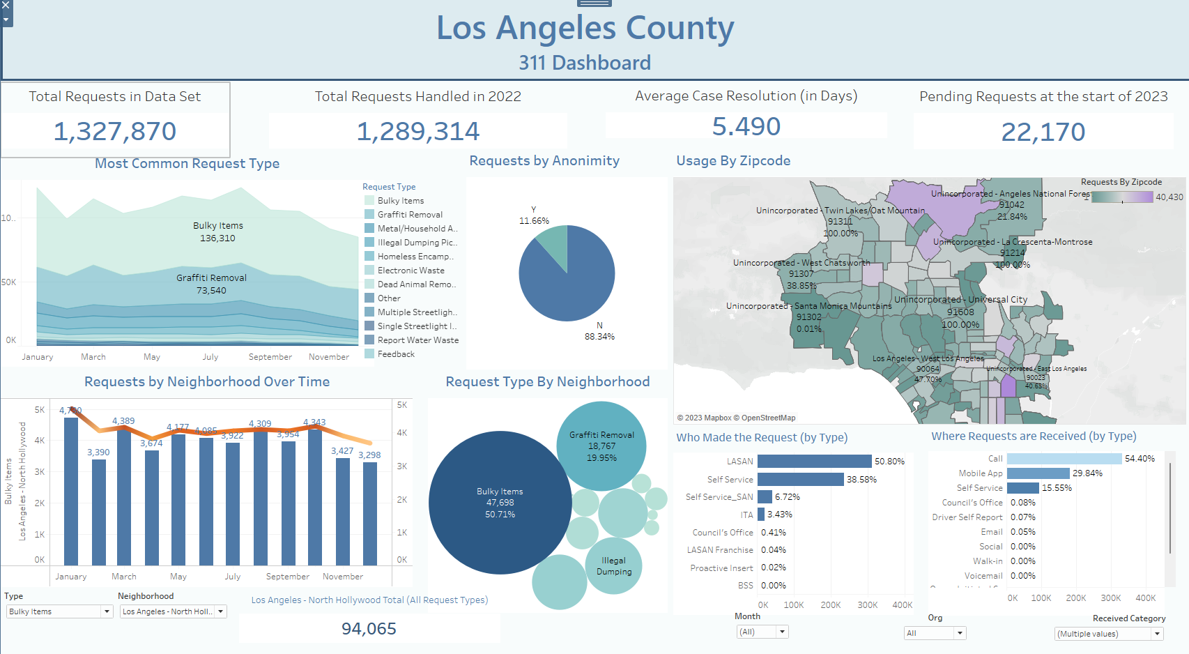
A comprehensive and interactive dashboard which captures 311 service usage across the Los Angeles county for calendar year 2022. This type of data can serve to plan, organize, and render better allocation of resources for heavily utilized neighborhoods in the county. Among some of the summarized data collected include these key findings:
- Across all of 2022 the county received over 1.3 Million service requests, with most cases being resolved within 5.49 days.
- The most used services for the county were Bulky Items, and Graffiti Removal.
- Service usage will vary by neighborhood, but the majority of people/agencies that report service requests do not have a preference for anonymity.
- Most requests still come through by phone (54.4%), with mobile app usage being the second most used communication method.
- The neighborhoods with most volume of 311 usage are also within the most underprivileged neighborhoods in the city.
The Process
The project duration took between 1 to 2 weeks, and was conducted using SQL queries with PostgreSQL, while leveraging Tableau for data visualization.
The P.A.C.E. methodology served as the guiding framework for effectively managing the project scope, execution, and delivery. It encompassed essential steps such as data cleaning, assessing and understanding the available features, handling data transformations, addressing missing data and outliers. Once the data was properly processed, exploratory data analysis techniques were employed to gain deeper insights and create specialized views, which were further explored and visualized using Tableau.
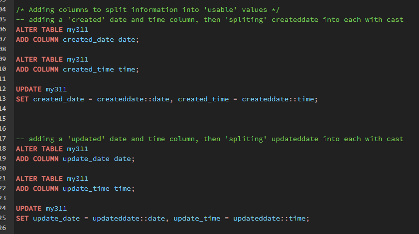
- A brief view at some data cleaning steps done early in the project. Data was either converted from one type, extracted or transformed.
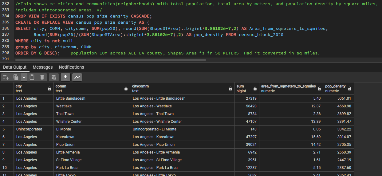
- Queries were done to create new variables from existing data, such as 'pop_density' using existing area measurements and population sizes.
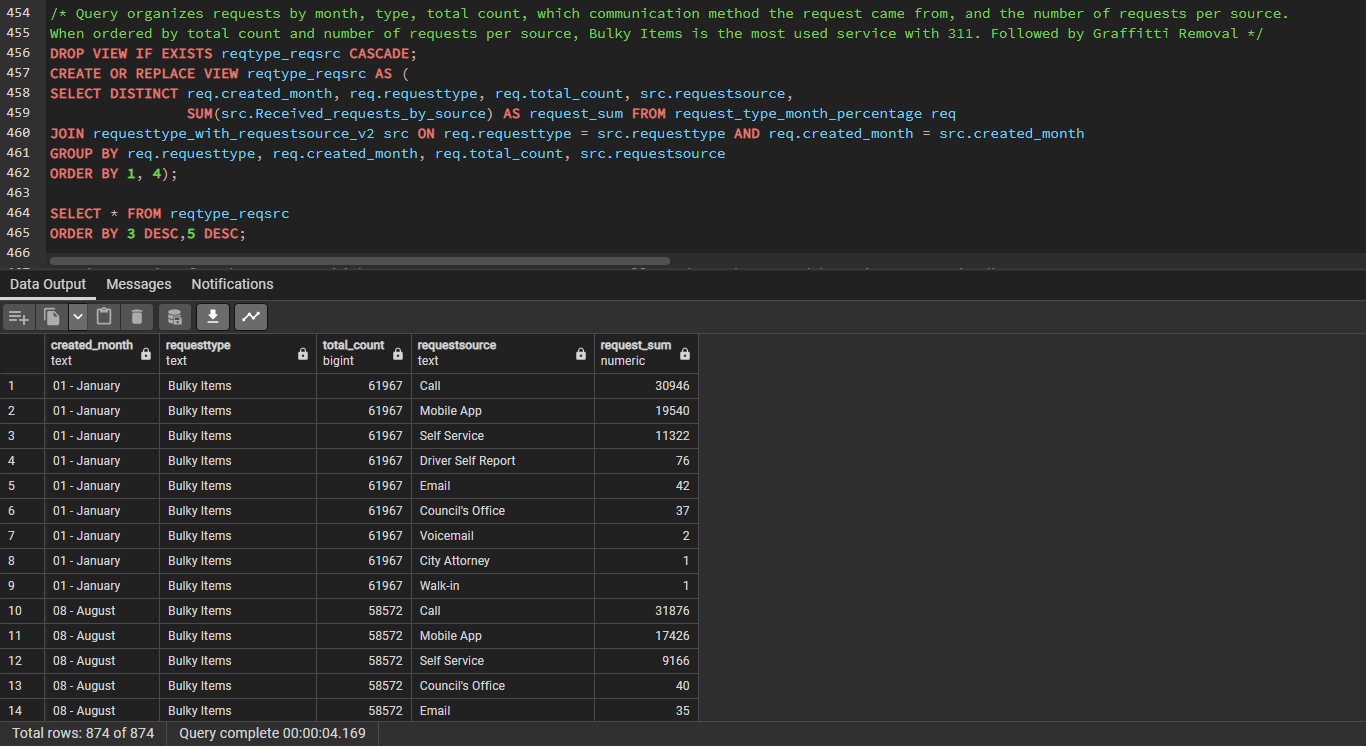

- Specific queries were used to organize the relevance between population density, 311 usage, and neighborhoods to show a better view of services rendered in the county.
The utilization of SQL for data analysis in this project facilitated efficient retrieval and manipulation of large datasets, optimization of query performance, maintenance of data integrity and security, and the ability to leverage scalability and reliability. That kind of efficiency made it feasible to keep the project within the allocated time frame.
Some future considerations:
- Conduct further analysis on specific service request types, exploring correlations with demographic data, temporal patterns, or predictive modeling.
- Engage with stakeholders by sharing the Tableau dashboard and project findings, seeking feedback to refine the analysis and improve understanding.
- Regularly update the dataset to track service pattern evolution over time and identify emerging trends or shifts in demand.
- Explore collaboration opportunities with other data analysts or researchers working on similar projects.
- Monitor the impact of decisions or actions taken based on project findings through impact assessments.